Manager Effectiveness Metrics That Name the Person to Talk To
Most manager scorecards produce one number per manager. That's enough to rank them. It rarely tells anyone what to do on Monday. Below are 14 manager effectiveness metrics grouped into outcome, behavior and perception families, the formula for each, an honest account of which ones a manager controls, and the attribution problem that makes manager league tables so easy to misread.
motivator data on 10,000+ people across four generations
One manager effectiveness score, five different Mondays
Illustrative · one team of five
Swipe to see the full team →
The 3.8 says nothing about who. The profiles say who ranks the two drivers that moved, and those two people need opposite things from the same manager.
Team pulse steady on the driver this person ranks highest Team pulse down on it: a name to start with, invisible in the average
Definition
What Are Manager Effectiveness Metrics?
Manager effectiveness metrics are the measures used to judge how well a manager leads a team. They come in three families: the outcomes the team produced, the management behaviors the manager performed, and how the team perceives being managed by them. A usable set spans all three, because each family on its own can be gamed, delayed, or explained away by circumstances the manager never controlled.
Outcome Metrics
What the team produced: retention, promotions, goal attainment, ramp time. The metrics executives trust most. They are also the ones most contaminated by things the manager never chose.
Behavior Metrics
What the manager did: one-to-ones held, feedback given, development conversations covered, decisions returned. The only family a manager can change this week by deciding to.
Perception Metrics
What it feels like to report to them: upward feedback, engagement, psychological safety, and whether each person's drivers are being met. The closest thing to a leading indicator.
The short answer
Track five to seven manager effectiveness metrics: two outcome, two behavior, and two or three perception. Read the outcome metrics as direction, the behavior metrics as accountability, and the perception metrics as your early warning. Full breakdown of all 14 is below.
The Numbers
Manager Engagement Fell Nine Points, and Most Scorecards Read Fine
The population being measured is itself under strain. Gallup's 2026 State of the Global Workplace puts the scale of it plainly, and it is worth knowing before you design a scorecard that assumes the manager is the stable part of the system.
22%
of managers were engaged at work in 2025, down five points from 27% the year before, the steepest single-year fall in the manager series Gallup publishes.
of managers were engaged inside best-practice organizations, close to quadruple the 20% recorded for employees globally. Our reading of that gap: where a manager works predicts more than who they are.
Low engagement cost the world economy roughly $10 trillion in lost productivity in 2025, about 9% of global GDP, on Gallup's estimate. Manager measurement is one of the few levers that sits upstream of that number.
Who This Is For
Sound Familiar?
The People Analytics Lead Building the Scorecard
Asked for a manager effectiveness dashboard by the end of the quarter
You can pull turnover, promotion rate and survey scores by manager today, and you already know the small teams will produce nonsense.
Half your candidate metrics measure the business unit more than the manager, and you have no clean way to separate the two.
Leadership wants a ranking. You know a ranking will punish whoever inherited the hardest team.
"I can build the scorecard. I just can't defend it yet in the room where it gets used."
The Leader Who Has the Scores Already
Runs 40 to 400 people through a layer of managers
Every manager has a number. You still cannot tell which of them is about to lose someone good.
The manager with the worst score has the hardest brief. The manager with the best score has three people quietly checked out.
Your review conversation with each manager runs on the same generic advice, because the data underneath it is one figure deep.
"I have twelve scores and no idea what to say differently to any of the twelve."
The Core Set
14 Manager Effectiveness Metrics and KPIs, and What Each One Tells You
Every metric below includes how to calculate it and the conditions under which it reads wrong. That second part matters more than the formula: most manager scorecards fail because a metric was trusted in a situation it was never able to describe.
Outcome Metrics: What the Team Produced
Read these as direction over several quarters. Any one of them, over one quarter, on a team of six, is noise.
Outcome · 1
Team Voluntary Turnover Rate
The share of the manager's team who chose to leave over a period. The metric almost every scorecard opens with, and the one most often used unfairly.
Formula: (voluntary leavers from the team ÷ average team headcount) × 100, annualisedReads wrong when: the team is small, the market for those skills is hot, or the manager inherited a team already halfway out the door. On a team of six, one resignation is 17%.
Outcome · 2
Regrettable Turnover Rate
Of the people who left, how many you wanted to keep. This separates a manager losing strong people from a manager finally addressing a performance problem.
Formula: (regrettable leavers ÷ total voluntary leavers) × 100Reads wrong when: the regrettable flag is set after the fact by the same manager being measured. Fix the incentive by having the flag set at exit by a second person.
Outcome · 3
Internal Mobility and Promotion Rate
How often people move up or across out of this manager's team. Managers who grow people are visible here and often invisible everywhere else.
Formula: (promotions + lateral moves out of the team ÷ average team headcount) × 100, annualisedReads wrong when: the org has no open roles. A manager can develop people impeccably for two years and score zero because nothing above them moved.
Outcome · 4
Team Goal Attainment Rate
The proportion of the team's committed goals that were met in the period. The closest outcome metric to the business result the manager was hired to produce.
Formula: (goals met ÷ goals committed) × 100Reads wrong when: the manager sets their own goals. Attainment then measures ambition calibration, and the reliable way to score 100% is to commit to less.
Outcome · 5
Time to Productivity for New Hires
How long a new joiner on this team takes to reach an agreed proficiency bar. A clean read on the manager's onboarding, because the clock starts on their watch.
Formula: median days from start date to the agreed proficiency milestoneReads wrong when: the proficiency bar is defined differently team to team, which it usually is. Compare a manager against their own trend rather than against another team.
Behavior Metrics: What the Manager Actually Did
The only family a manager can move this week by deciding to. Use these for accountability. Keep the targets low enough that nobody has to game them.
Behavior · 6
One-to-One Cadence Adherence
Whether the one-to-ones on the calendar actually happen. Cheap to collect. When a manager goes underwater, this is the first thing they drop. We know of no study showing it predicts turnover on its own, and we have never seen a healthy team where these quietly stopped.
Formula: (one-to-ones held ÷ one-to-ones scheduled) × 100, per report per quarterReads wrong when: you measure only the aggregate. A manager at 90% who has cancelled on the same person six times in a row looks fine. Track it per report.
Behavior · 7
Feedback Frequency
How often this manager gives specific, documented feedback, praise and correction both. Distinguishes managers who feed back continuously from managers who save it for review season.
Formula: documented feedback instances ÷ reports ÷ quarterReads wrong when: the target becomes a quota. Volume rises, specificity collapses, and you have taught the team to ignore feedback. Pair it with a quality item in the survey.
Behavior · 8
Development Conversation Coverage
The share of the team who have had a real conversation about where they are going in the last six months. Coverage catches the person quietly skipped over.
Formula: (reports with a documented development conversation in the last 6 months ÷ total reports) × 100Reads wrong when: the documentation is the deliverable. A filed form proves a form was filed. Ask the report whether the conversation changed anything.
Behavior · 9
Recognition Reach
What proportion of the team was recognised at least once in the quarter. The raw count hides that answer, and reach exposes the manager with one favourite.
Formula: (reports recognised at least once in the quarter ÷ total reports) × 100Reads wrong when: you track volume instead of reach. Ten recognitions all pointed at the same two people is a distribution problem wearing a good number.
Behavior · 10
Decision Turnaround Time
How long the team waits on this manager for a decision or an approval. Rarely put on a scorecard. In our experience it's the thing reports complain about most.
Formula: median elapsed time from a request reaching the manager to a decision being returnedReads wrong when: the manager lacks the authority to decide. You then measure the layer above them, which is worth knowing and unfair to attribute here.
Perception Metrics: What It Is Like to Report to Them
The nearest thing to an early warning, and the family where anonymity and team size need real care.
Perception · 11
Manager Effectiveness Index
The composite of manager-specific items in an upward feedback survey: clarity, support, fairness, growth, and whether the person would choose to work for them again.
Formula: mean percentage favorable across the manager-specific items, reported only at n ≥ 4Reads wrong when: reported below four respondents, or when a manager sits in the room while the team completes it. Both destroy the candor the index depends on.
Perception · 12
Team Engagement Score
The team's own engagement result, which is where the 70% manager variance figure actually shows up. Useful, lagging, and averaged twice over.
Formula: percentage favorable, or mean on a 5-point scale, across the engagement items for that teamReads wrong when: read as a manager verdict. A reorganisation, a pay freeze or a cancelled product will move a team's engagement with no help from the manager. See how to measure employee engagement for the full method.
Perception · 13
Psychological Safety Score
Whether people on this team will admit a mistake, disagree with the manager, or raise a problem early. The upstream condition for every other metric on this page.
Formula: mean favorable across the psychological safety items, tracked per team over timeReads wrong when: the score is high because nobody has been tested yet. A team that has never had bad news to deliver has an untested safety score.
Perception · 14
Motivator Alignment
The fit between the drivers each report ranks highest and what their role currently delivers. Two halves: motivator profiles are individual by design, so a manager knows who ranks Autonomy or Feedback top, while the motivation satisfaction pulse reports for the team at a minimum of three respondents, which keeps individual answers unattributable. Read together, a team-level dip points at named people.
Formula: each report's ranked drivers (individual) read against the team's satisfaction pulse on those drivers (team level, n ≥ 3)Reads wrong when: the pulse is read as an individual score. The pulse is a team reading whose own floor is three respondents; the four-report floor we recommend for the survey-based perception metrics is deliberately stricter. The profile is the individual half, and it is what tells you which people a team-level dip is most likely about.
The Omissions
Three Metrics We Left Off, and Two Worth Adding If You Have the Data
A list of 14 is a set of choices, and the choices are arguable. Here are the ones we expect to be challenged on.
The manager's own engagement, which we would add first. Gallup has manager engagement at 22% and down nine points since 2022, so the population being measured is the strained one. A manager scorecard that never reads the manager's own state will keep recommending more one-to-ones to somebody who is already underwater. If you run an engagement survey, pull the manager cohort out as its own number and put it at the top of the sheet.
Coaching and promotion equity, which needs a bigger sample than most teams have. Recognition reach (metric 9) asks whether everyone got recognised. The harder question is whether recognition, stretch work and promotions distribute evenly across demographic groups inside a manager's team. On a team of eight the numbers are too small to mean anything, so run it at function or department level rather than per manager.
Absence and burnout trend. We left absenteeism off deliberately, because it behaves as an outcome metric while being read as a behavior one, and because the same rise can mean a demanding quarter, a norovirus, or a manager problem. Track it at the organization level, and treat a per-manager spike as a question to ask, and stop short of calling it a finding.
Meeting load and focus time, if your calendar data is clean. Collaboration-analytics platforms build much of their manager scorecard from calendar-derived measures: meeting hours for individual contributors against managers, the share of the week left as uninterrupted blocks, span of control. They sit naturally in the behavior family, they need no survey, and they are the only metrics here with published vendor benchmarks to compare against.
Span of control. Not a performance metric at all, and worth recording next to every other number on this page. A manager with 4 reports and a manager with 19 are doing different jobs, and most of the metrics above will read differently for each without either of them managing better or worse.
Upward Feedback and 360-Degree Feedback Are Not the Same Instrument
Metric 11 is upward feedback: the manager's own reports rating the experience of being managed by them. A 360 widens that to peers, internal customers and the manager's own manager, which answers a different question and costs considerably more to run. For a scorecard you refresh quarterly, upward feedback is the right instrument, because the people best placed to judge day-to-day management are the people being managed. Keep the 360 for development cycles and promotion decisions, where the breadth earns its cost and the once-a-year cadence is acceptable.
How the Families Differ
Outcome, Behavior and Perception Metrics
The practical reason to keep the three families separate is that they answer different questions, arrive at different speeds, and are confounded to very different degrees. Mixing them into one composite score destroys all three properties at once.
Family
Question it answers
How fast it moves
How confounded
Best used for
Outcome
Did this team produce the result?
Slow. Two to four quarters before a trend is real.
Direction over years. It cannot support a quarterly ranking.
Behavior
Did this manager do the job of managing?
Immediately. Visible within a fortnight.
Lightly. Mostly within the manager's control.
Accountability and coaching conversations.
Perception
What is it like to be managed by them?
Weeks, at survey cadence. Continuous if instrumented.
Moderately. Org events move it independently of the manager.
Early warning, and choosing who to talk to first.
Scroll the table sideways to see every column →
The one rule worth keeping
Hold managers accountable for the behavior family, coach them using the perception family, and evaluate the organization using the outcome family. The common failure is doing it in reverse: holding a manager accountable for an outcome they did not control, while ignoring the behaviors they did.
The Hard Part
The Attribution Trap in Manager Metrics
Almost every manager effectiveness metric measures the manager plus their circumstances, and the two arrive fused together. A manager who took over a team mid-restructure, in a market where their skills are being bid up, on a product that just lost its funding, will produce worse numbers than a manager of equal skill who inherited none of that. Four things reduce the damage.
01
Compare a Manager to Their Own Baseline
A league table across managers compares people with different starting conditions. A manager's own trend across four quarters holds most of those conditions constant, and it answers the question you care about: are they getting better?
02
Weight Behavior Metrics Above Outcome Metrics
The behavior family is the part the manager controls, so it carries the accountability. Outcome metrics belong on the scorecard as context and direction. Reversing that weighting produces a scorecard that rewards luck and inherited advantage.
03
Set a Minimum Team Size and Hold It
Below about four reports, every rate metric becomes a coin flip and every survey result becomes identifiable. There isn't a clever way around this one. Report those teams qualitatively or roll them up. A precise-looking percentage on a team of three is worse than no number at all.
04
Record What the Manager Inherited
Log tenure in role, team composition at handover, and any reorganisation inside the window. Without those three fields, a low first-year score is indistinguishable from a low performer, and you will eventually act on the wrong one.
A Small Historical Aside
Why One Manager Effectiveness Score Describes Nobody on the Team
Not one of them was average, and no manager is either. In 1950 the US Air Force ran an anthropometric survey of its flying personnel, which left it with 131 available body measurements and a sample of 4,063 men. A lieutenant in the Aero Medical Laboratory, Gilbert Daniels, took ten of those measurements and put a plain question to the data: how many of these 4,063 men are average on all ten at once?
He was generous about what counted. His "approximately average" band was roughly the middle 30% of the population on each measurement, which he noted was "a considerably more generous portion of the group than is included by the exact average value." Then he went through the file one measurement at a time. Of the 4,063 men, 1,055 had approximately average stature. Of those 1,055, some 302 also had an average chest circumference. Of those 302, 143 also had an average sleeve length. Then 73. Then 28, 12, 6, 3, 2. At the tenth measurement, the number left was zero.
Daniels had picked the ten measurements that mattered for designing clothing, and he pointed out in passing that measurements for "cockpit layout or seat design could equally well have been chosen" and would have given much the same answer. He opened the note by calling the tendency to think in terms of the average man "a pitfall into which many persons blunder when attempting to apply human body size data to design problems." Earlier in the same note he calls the average man "a very rare specimen and very hard to fit." His conclusion is blunter: the average man is "a misleading and illusory concept as a basis for design criteria, and is particularly so when more than one dimension is being considered." The average man had been carefully measured, and he did not exist.
A manager effectiveness score of 3.8 is a garment cut for that man. It is a real measurement, honestly taken, describing somebody on that team who is not there. The two people about to resign are both inside the 3.8, and so is the person who is perfectly content, and the number gives the manager the same advice about all three.
Daniels published this in December 1952 as a short technical note titled "The 'Average Man'?", which is available in full as the DTIC copy on the Internet Archive. The elimination table is on page three, and the whole thing takes about ten minutes.
Cut to fit: one person's drivers, ranked and individually tracked
Sizing the Set
How Many Manager Effectiveness Metrics Should You Track?
Five to seven. Two outcome, two behavior, and two or three perception. That is enough to triangulate and few enough that every manager can hold the whole set in their head. That is the real constraint.
Why Not Three
Three metrics cannot triangulate. With one metric per family you have no way to tell a genuine signal from a quirk of that particular measure, and any single number can be moved without the underlying reality changing.
Why Not Fifteen
Past about eight, managers stop reading the dashboard and start asking which two you actually care about. You then have a fifteen-metric scorecard and a two-metric reality, and nobody has written down which two.
Keep One Anchor Metric
Name one metric as the anchor and say so out loud. Regrettable turnover on the manager's team is the usual choice. An unnamed anchor gets chosen for you, informally, by whoever runs the review meeting.
Review the Set Annually
A metric that has not changed a single decision in a year is decoration. Drop it. The set should shrink and sharpen over time, and the annual review is where you check that a metric earned its slot.
The Build
How to Build a Manager Effectiveness Scorecard
This is the sequence that survives contact with a leadership meeting. It also answers the two questions people usually arrive with: how to evaluate manager success, and how to measure success as a manager when you are the manager being measured.
1
Write Down the Decision First
Decide what the scorecard is for before choosing a single metric: coaching, promotion, compensation, or spotting risk. Build a scorecard for coaching, then quietly use it for compensation, and you lose the honesty in every survey that feeds it.
2
Pick Two Metrics From Each Family
Two outcome, two behavior, two perception, taken from the 14 above. Write the formula next to each one, in the document, in full. Half the disputes about a manager scorecard turn out to be disputes about a denominator.
3
Weight Behavior Heaviest
A defensible split is roughly 50% behavior, 30% perception, 20% outcome. That ordering tracks how much control the manager has over each family, and it is the part you will be asked to justify.
4
Set the Comparison to the Manager's Own History
Report each metric as the manager's own four-quarter trend, with the org median shown faintly for context. Ranking managers against each other invites the attribution error the whole scorecard exists to avoid.
5
Publish the Suppression Rules
State the minimum team size for reporting, who can see what, and what happens to a manager with three reports. Publishing this before the first run is what makes the survey answers usable. Retrofitting it afterwards does not restore the candor you already spent.
6
Attach One Action to Every Metric
For each metric, write the sentence a manager should say in their next one-to-one when it moves the wrong way. A scorecard with no attached action produces anxiety and no behavior change. Most manager dashboards end up there and stay.
A Worked Manager Effectiveness Scorecard
Six metrics for a manager with a team of six. Five of the six are things they can move inside a quarter. The sixth tells you whether the other five are working.
Metric
Family
How it is calculated
Weight
What you do when it moves
Regrettable turnover rate (anchor)
Outcome
Regrettable leavers ÷ total voluntary leavers × 100
10%
Read the last two exit conversations before drawing any conclusion about the manager.
Check whether roles existed to move into before crediting or blaming the manager.
One-to-one cadence adherence, per report
Behavior
One-to-ones held ÷ one-to-ones scheduled × 100
25%
Name the specific report who keeps getting cancelled on, and ask why that one.
Development conversation coverage
Behavior
Reports with a documented conversation in 6 months ÷ reports × 100
25%
Book the missing conversations this month, starting with the longest-tenured gap.
Manager effectiveness index
Perception
Mean % favorable across manager-specific survey items, n ≥ 4
15%
Find the individual item that moved and discuss that one. Leave the composite alone.
Motivator alignment, per report
Perception
Team satisfaction pulse (n ≥ 3) read against each report's ranked drivers
15%
Look up who ranks the dipping driver highest, and talk to them this week.
Scroll the table sideways to see every column →
Copies as plain text, deliberately: paste it into a doc or a ticket without the column widths arriving mangled.
Where this one does not apply. It assumes calendars, one-to-ones already in place, and a team large enough to report on. It breaks on frontline and shift work, where there is often no shared calendar and no company email; on spans of control past about twelve, where per-report tracking stops being realistic; and on teams of three or fewer, where the suppression floor removes most of the perception family. Unionised workplaces will usually need the behavior metrics agreed before they are collected at all.
How to Evaluate Manager Success
Evaluate a manager against their own four-quarter trend. A peer ranking punishes whoever inherited the hardest team, so keep the comparison internal to the manager. Weight the behaviors they control above the outcomes they partly inherited. Record tenure in role, the team they took over, and any reorganisation inside the window, so a hard first year stays distinguishable from a weak manager. Suppress every number below four reports.
How Do You Measure Success as a Manager?
If you are the manager being measured, hold every one-to-one you scheduled, give each report documented feedback at least monthly, have a real development conversation with everyone inside six months, and return decisions inside a turnaround you have stated out loud. Those four are yours. Then watch your upward feedback score and whether each person's top drivers are being met, because those two move first when something is going wrong.
How Often Should You Measure Manager Effectiveness?
Behavior metrics monthly, since they come from calendar and workflow data you already hold and reading them costs nothing. Perception metrics quarterly at the slowest, and continuously if your instrument allows it. Outcome metrics annually, and only ever as a four-quarter trend. Reviewing an outcome metric monthly produces noise that people then act on, and that is worse than not reading it.
What Is a Good Manager Effectiveness Score?
There is no universal target. A manager effectiveness metric is healthy when that manager's own four-quarter trend is flat or improving, and it is worth a conversation when it moves outside their own historical range. The three numbers we do stand behind are the suppression floor of four reports, a weighting of roughly 50% behavior / 30% perception / 20% outcome, and the arithmetic that one resignation on a team of six reads as 17%.
We publish no benchmark targets, for a reason worth defending. Tell an organization that 90% one-to-one adherence is good and you'll get 90% adherence with the same three people cancelled every month. That is the whole problem with a published target: it becomes a quota. Every target on this page would also be wrong for somebody, because the right feedback frequency for a team of three senior engineers is not the right frequency for twelve first-year hires.
Three comparisons carry more information than a benchmark, and you already have all three. Compare the manager to their own previous four quarters, which holds their circumstances roughly constant. Compare them to the median of managers inside the same function, which controls for the market they hire in. And compare each report against their own history rather than against their teammates, since a person whose engagement fell 20 points to a still-respectable score is the one worth talking to today.
The Soft Half
How to Measure a Manager's People Skills
People skills are usually declared unmeasurable, then measured badly by a single survey question about communication. They break into four observable components, and each one has a metric already on this page attached to it.
Attention: does this manager know what is going on with each person? Measured by one-to-one cadence adherence per report, and by whether the manager can name each report's top driver without checking.
Candor: can they say a hard thing clearly and keep the relationship? Measured by feedback frequency paired with the psychological safety score. High feedback with low safety means the delivery is doing damage.
Adaptability: do they manage different people differently? Read the team's motivator profiles side by side. A manager whose six reports rank six different drivers highest, and who runs the same weekly routine at all of them, is running one style against six different needs.
Follow-through: does anything change after the conversation? Measured by decision turnaround time and development conversation coverage, checked with the report rather than the file.
Adaptability is the component we see left off scorecards most often, largely because measuring it at all needs per-person data. Our deeper treatment of the skills themselves, rather than their measurement, is at how managers can improve their people skills. If you are measuring managers in order to develop them, that page is the other half of this one.
Failure Modes
4 Reasons Manager Scorecards Fail to Change Behavior
01
The Number Is an Average of Averages
A team engagement score is already a mean across people. Rolling it into a manager composite averages it again. Two rounds of averaging removes the individual variation that told you what to do, and leaves a figure precise enough to act on and too coarse to act with.
02
Everything on It Is Lagging
Turnover, exit interviews and annual survey results all describe decisions people have already made. A scorecard built entirely from them is an accurate history of a problem, delivered after the window for fixing it closed.
03
It Never Names a Person
A manager told their effectiveness index fell four points has learned that something's wrong and nothing about where. The useful version of that alert names the driver that stopped being met and the two people who rank it highest.
04
The Advice Attached to It Is Generic
Every manager below the median gets sent the same coaching module. The manager who over-manages an autonomy-driven engineer and the manager who under-communicates with someone who needs feedback both receive "improve your communication", which helps neither.
How Attuned Works
From an Averaged Score to a Per-Person Reading, in Under a Week
Attuned adds one metric to the set on this page and changes the resolution of two others. Two instruments: a 10-minute assessment that ranks one person's 11 drivers, and a recurring pulse on whether those drivers are being met, read at team level with a floor of three respondents.
Step 0 · The Assessment
Every Person Ranks Their 11 Intrinsic Drivers
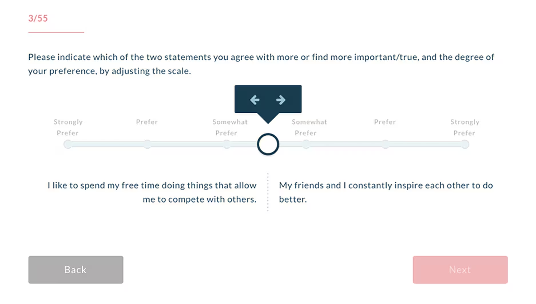
Each team member completes the Intrinsic Motivation Assessment: 55 forced-choice questions, about 10 minutes, producing a ranked profile across all 11 motivators. There are 39,916,800 ways to order 11 things, so across the 10,000+ people we have assessed, two identical profiles would be close to a coincidence. Your team has six of them, and the scorecard reports their mean.
The assessment: forced-choice, 55 questions
10 minper person
11motivators ranked
39.9Mpossible orderings
10,000+people assessed, four generations
1
A Team-Level Dip Acquires Names
A manager score of 3.8 says nothing about who. When the team's satisfaction pulse on Autonomy falls, the manager already knows which two people rank Autonomy highest, because the profiles are individual. The dip arrives with a shortlist.
2
The Perception Family Stops Waiting on a Survey
Attuned runs the satisfaction pulse on a short recurring cycle, so a decline surfaces in weeks instead of at the end of the year. That moves the perception family from confirming what already happened toward flagging what is about to happen.
3
Each Metric Arrives With a Sentence to Say
AI TalkCoach reads each person's motivator profile and current gaps and gives the manager what to ask, how to frame it and what to steer around. It is the "attach one action to every metric" step from the build sequence, with the language already drafted.
4
Team Patterns Stay Visible Without Averaging
Where a whole team's drivers cluster, the team view shows it, and the individual readings stay intact underneath. You get the pattern and keep the people. The composite score threw that away.
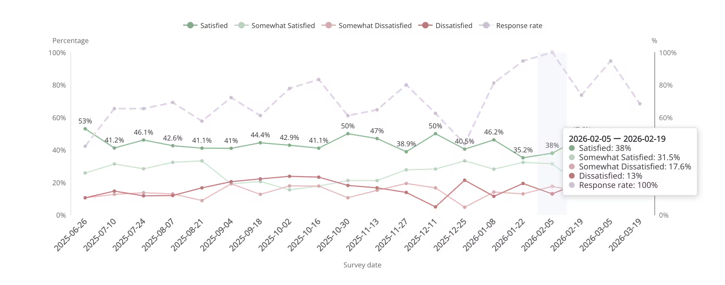
Satisfaction over time
Watching a Driver Come Loose
Satisfaction is tracked against the drivers a team actually ranks highest. A downward slope on one of them moves weeks before a resignation decision, which puts it ahead of the annual survey cycle, and it tells you the driver and roughly when the slide started.
Motivator satisfaction, tracked over time
Past the average
You Have the Manager Scores. The Missing Column Is the Shortlist.
A 20-minute call, your own manager scorecard on the screen, and an honest read on which metrics are carrying weight they cannot support.
No preparation needed. Bring the scorecard you already have.
Featured Case Study
How a Growing Firm Stopped Managing on Instinct
Azon Recruitment Group is an Irish recruitment firm, so the metrics on their scorecard are not the ones a manufacturer or a bank would pick. What transfers is the shift underneath: from a manager's general impression of how someone was doing, to a specific per-person reading that could be checked. That shift is what the 14 metrics above are for.
An award-winning Irish recruitment agency, and one of the country's fastest-growing talent providers.
Azon's read on how people were doing rested on body language and on what surfaced through their managers, until a resignation proved the instinct wrong. "Typically, if an employee was engaged and they looked like they were happy, the assumption would be they were fine," says Denise Grant, Manager for HR Recruitment at Azon, "until you get their resignation and you realize at an exit interview that they weren't as happy as you had assumed." That is the perception family failing in the way it usually fails: the signal existed, and no instrument was pointed at it. Attuned gave them a measured, individual view of what each person valued, so a general impression could be checked against something specific.
"Being able to get to the nub of people's underlying motivations at the start of a process and see what really drives and motivates people in the workplace has been very helpful when trying to hire, and we've seen a dramatic increase in the numbers of people we hire that we feel we've gotten right, and that are a right fit for the business."
Kevin Halligan, Associate Director, Banking & Financial Services, Azon
"Since beginning to use the software, we have really seen that benefit translating to earnings for our business."
Kevin Halligan, Associate Director, Banking & Financial Services, Azon
Go Deeper
Resources for Measuring Managers and Then Developing Them
A scorecard tells you which manager to talk to. These cover what to say once you get there.
The State of Motivation Report
Our own data set: motivator profiles from 10,000+ people across four generations, including how driver profiles differ by role and seniority. The empirical basis for metric 14.
Every Organization Can Score Its Managers. Knowing Which Person to Talk to on Monday Is the Hard Part.
The Profile Is Individual
Every other metric on this page resolves to a team and stops there. Motivator profiles are individual by design, so when a team reading moves you can see which people rank that driver highest. The shortlist is the part a manager can act on.
A Leading Indicator
Motivator satisfaction moves weeks before someone decides to leave, which puts it ahead of turnover, exit interviews and the annual survey. Those three report decisions already taken.
Built With Psychologists, Normed on Real Data
Attuned worked with psychologists to define 11 workplace motivators, each scored 0 to 100 against a single global norm, so a 72 means the same thing in Tokyo and in Texas. It sits in the same family of self-report instruments as the Reiss Motivation Profile (Reiss, 2004) and Amabile's Work Preference Inventory (1994). We have not published a peer-reviewed validation paper, and we do not claim one. The full instrument comparison is on our intrinsic motivation assessment page.
An Action Attached to the Number
AI TalkCoach converts one person's profile and current gaps into prompts for the next one-to-one. The manager opens it while preparing, and the metric arrives with the sentence to say.
FAQ
Manager Effectiveness Metrics: Common Questions
What are manager effectiveness metrics?
Manager effectiveness metrics are the measures used to judge how well a manager leads a team. They fall into three families: outcome metrics (team turnover, promotions, goal attainment, ramp time), behavior metrics (one-to-ones held, feedback given, development conversations covered, decision turnaround), and perception metrics (upward feedback, engagement, psychological safety, and how well each person's motivational drivers are met). A usable set draws from all three, because each family on its own can be gamed, delayed, or explained away by circumstances the manager never controlled.
How do you measure success as a manager?
Measure it on the things you control and read the rest as context. Concretely: hold every scheduled one-to-one, give documented feedback to each report at least monthly, have a real development conversation with every report inside six months, and return decisions inside a stated turnaround. Then watch two perception measures, your team's upward feedback score and whether each person's top drivers are being met, as your early warning. Team turnover and goal attainment still belong on the sheet. Just don't steer by them week to week: by the time either one moves, whatever moved it was decided months ago.
How do you evaluate manager success?
Evaluate a manager against their own trend across four quarters rather than against a ranking of their peers, using six metrics: two outcome, two behavior, two perception. Weight the behavior family heaviest, at roughly 50%, because that is the part the manager controls. Record what they inherited (tenure in role, team composition at handover, any reorganisation in the window) so a difficult first year is distinguishable from poor performance. Suppress reporting below four reports, where rate metrics become noise and survey answers become identifiable.
How many manager effectiveness metrics should a company track?
Five to seven: two outcome, two behavior, and two or three perception. Three cannot triangulate, since a single metric per family gives you no way to separate a real signal from a quirk of that measure. Past about eight, managers stop reading the dashboard and start asking which two you actually care about. Name one metric as the anchor, usually regrettable turnover on the manager's team, and review the whole set once a year, dropping any metric that has not changed a decision.
How do you measure a manager's people skills?
Break people skills into four observable components and attach an existing metric to each. Attention: one-to-one cadence adherence per report, plus whether the manager can name each report's top driver unprompted. Candor: feedback frequency paired with the psychological safety score, since high feedback with low safety means the delivery is causing harm. Adaptability: the team's motivator profiles read side by side, which exposes a manager running one style against six people who rank six different drivers highest. Follow-through: decision turnaround time and development conversation coverage, verified with the report rather than the file. Adaptability is the component we see left off scorecards most often, largely because measuring it at all needs per-person data.
What is a manager effectiveness scorecard?
A manager effectiveness scorecard is a short, fixed set of metrics reported per manager on a regular cadence, with the formula for each written down and a stated weighting between them. A defensible build states its purpose first (coaching, promotion, compensation or risk), takes two metrics from each family, weights behavior at about 50%, compares each manager to their own four-quarter trend, publishes the minimum team size for reporting, and attaches a specific action to every metric. Scorecards that skip the purpose statement tend to get built for coaching and then used for compensation, which removes the honesty from every survey feeding them.
Is team turnover a fair measure of a manager?
Team turnover is a useful direction and a poor verdict. It measures the manager together with their circumstances: the market for those skills, the team they inherited, headcount and budget decisions taken above them, and the fortunes of the product they support. On a team of six, one resignation reads as 17%. Use regrettable turnover rather than raw turnover, have the regrettable flag set at exit by someone other than the manager being measured, track it over four quarters against that manager's own history, and give it a minority weighting on the scorecard.
What is the difference between manager effectiveness and employee engagement?
Employee engagement describes the state of the people on a team. Manager effectiveness describes the practice of the person leading it. They are tightly linked, since Gallup attributes around 70% of the variance in team engagement to the manager, and they need separate measurement: a team's engagement can fall because of a pay freeze or a reorganisation with no contribution from the manager, and a manager can be doing the job well inside a difficult quarter. Engagement belongs on a manager's scorecard as one perception metric among several. Treat it as the verdict and you will eventually discipline the wrong manager. Our full method for the team-level side is at how to measure employee engagement.
What is a good manager effectiveness score?
There is no universal target, and any published benchmark becomes a quota. A manager effectiveness metric is healthy when that manager's own four-quarter trend is flat or improving, and it is worth a conversation when it moves outside their own historical range. Compare a manager to their own previous four quarters, to the median of managers inside the same function, and compare each report against their own history rather than against their teammates. The three numbers we do stand behind are a suppression floor of four reports, a weighting of roughly 50% behavior, 30% perception and 20% outcome, and the arithmetic that one resignation on a team of six reads as 17%.
Can you measure manager effectiveness without a survey?
Yes, for the behavior and outcome families. One-to-one cadence adherence, feedback frequency, development conversation coverage, recognition reach and decision turnaround all come from calendar, HRIS and workflow data you already hold, and so do turnover, promotion rate, goal attainment and ramp time. The perception family does require asking people something, whether through an upward feedback instrument, a pulse, or a motivator assessment. You can build the whole thing from system data. It'll work, and it has one blind spot: it will show you a manager hitting every prescribed behavior while their team quietly checks out.
Manager Effectiveness Metrics
You Can Already Rank Your Managers. The Useful Version Names a Person and a Driver.
Bring the manager scorecard you have. We will show you where the averaging is hiding something, which metrics are carrying weight they cannot support, and what a per-person reading adds to the set.
20 minutes
10,000+ people assessed
No preparation needed
Talk to Attuned
A working session on the manager metrics you already track.
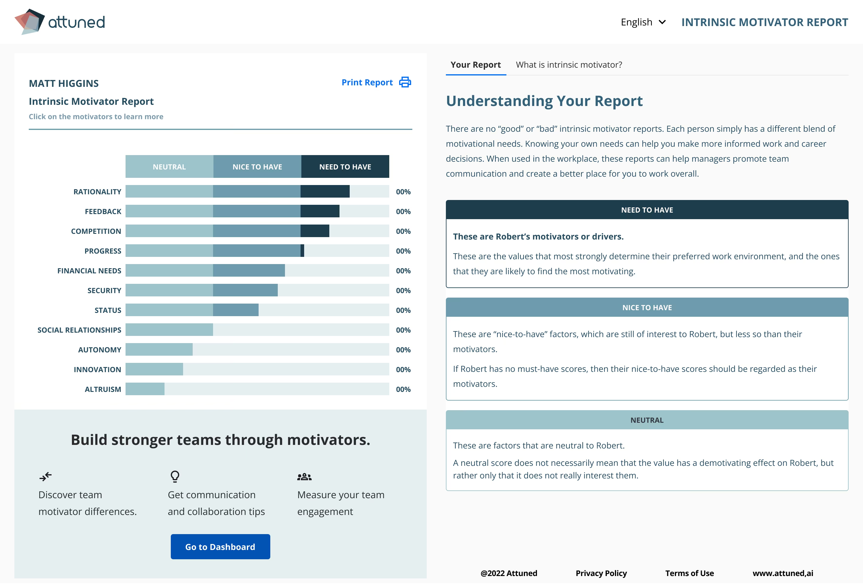 Cut to fit: one person's drivers, ranked and individually tracked